

End-to-end MVP Design:
Fitness-tracking app called
“Level Up”
In a world where fitness is increasingly prioritized for health, athleticism, and aesthetics, tracking workouts becomes essential for progress and motivation. Level Up offers insights into improvement, boosts accountability, and tailors workout plans for optimal results.
Roles: UI/UX Designer, UX Researcher
Agency: Design Lab
Duration: 4 weeks (~80 hours)
Tools Used: Figma, FigJam, Zoom, Discord
Design Process
-
Overview
-
Competitive Analysis, User Interviews
-
Affinity Mapping, User Personas, POVs & HMWs
-
Low-Fidelity Wireframes, High-Fidelity Wireframes, Branding
-
Usability testing for High-Fidelity Wireframes, Revisions & Follow up Usability Testing
-
Conclusions and Discissions
Problem
Overview
The Goals of this project are to:
Empower users by providing an efficient method to track their exercise routines
Foster precision, consistency, and discipline.
Creating an MVP to efficiently aid users in achieving their fitness goals is imperative in this endeavor.
Discovery (Research)
Competitive Analysis:
Examining fitness tracking apps like Strong, My Fitness Pal, and FitOn provided insights into their strengths and weaknesses. My Fitness Pal offers a well-rounded approach, catering to beginners and experienced users alike with its simplified interface. Strong targets experienced exercisers with its detailed interface, focusing on in-depth tracking. FitOn appeals more to beginners, lacking depth in tracking methods compared to competitors.
User Interviews:
Diverse user interviews were conducted, ranging from serious athletes to beginners embarking on their fitness journey. This provided insights into varying levels of experience and needs, including the desire for structure in tracking progress, clarity on what aspects to track, and the need for accountability and motivation.
Define (Synthesis)
Affinity mapping:
Synthesizing interview findings through affinity mapping helped identify common pain points. These research methods collectively informed the direction of the project, guiding the development of a fitness-tracking app tailored to meet the diverse needs of users across different experience levels.
Three key issues emerged:
The need for structured progress tracking
Clarity on tracked aspects of exercise
The importance of accountability and motivation.

Features Roadmap/Matrix:
Before deciding on design features, I revisited my research goals and formed hypotheses to pinpoint issues, helping prioritize features within the constraints of time and budget. Understanding my target audience—Users who want to be physically active, and users who want to be physically active—was crucial. Based on this, I focused on creating a user experience that allows beginners to begin their fitness journey and as well as help experienced people find easier ways to track their fitness progress. These changes aim to improve the accessibility of tracking fitness progression and as well assist beginners in starting their fitness journey with a variety of informational resources and social features for accountability and consistency.
Research Goals
Discover potential and current users’ needs and motivations to track their workout routines
Understand what services/features are most important to potential users
Understand pain points that may discourage users from tracking their progress
Explore key features that are successful in other fitness tracking platforms through competitive market research.
Target Audience
Users who want to are physically active, and users who want to be physically active
The data shows most people who exercise or use the gym tend to be between ages 18-34.
Develop (Design)
Task Flows:
I proceeded to chart the user journey by delineating a task flow depicting the streaming and music discovery process within 'Lend an Ear.' This visual representation offered deeper insight into user activity and interactions.
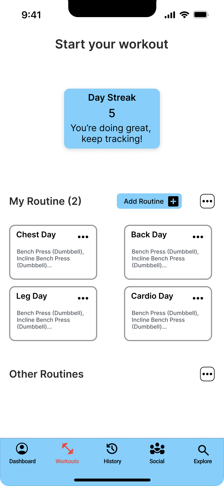
Low Fidelity Wireframes:
The app was crafted to accommodate both serious trackers and beginners, fostering inclusivity.
High Fidelity Wireframes:
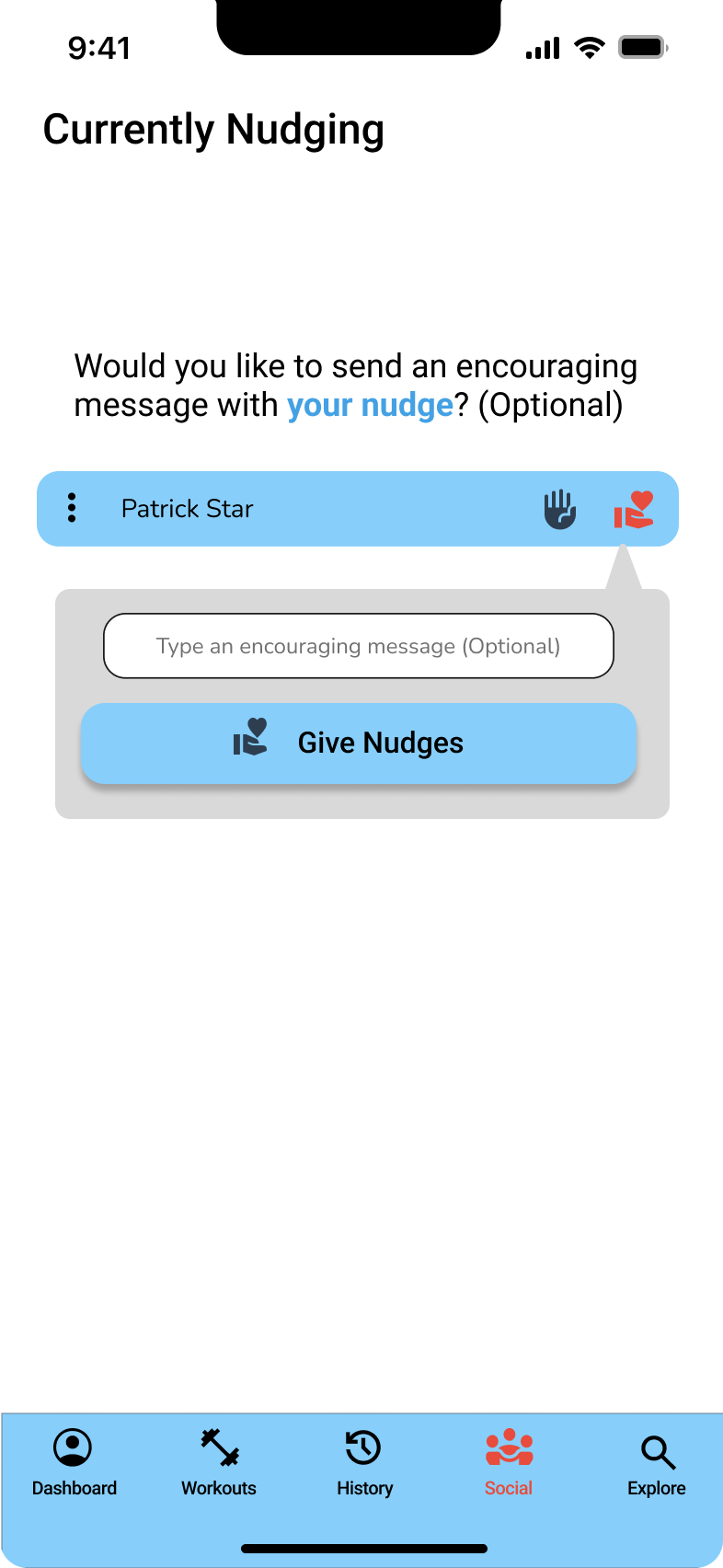
I included a nudging feature for users to encourage and support each other, fostering a positive feedback loop. Additionally, informative photo cards showcased targeted muscle groups, aiding users in building purposeful routines.
Branding:
The app, named "Level Up," aimed to embody values of growth and purposeful exercise for users of all experience levels. The motto "Invest in your future, and Level Up" encapsulated this ethos.
Color Palette: Light blue was chosen as the primary color for its connotations of clarity, inclusivity, and harmony, aligning with the app's mission
Logo: The logo featured an upward-pointing arrow, symbolizing growth, the core concept of the app


Delivery (Testing & Revisions)
Usability test for High-Fidelity prototype:
Following the creation of the High-Fidelity Prototype, a usability test was conducted to evaluate users' ability to navigate and utilize features such as nudges and fitness routine recording. While most participants found the tasks easy to complete, some encountered difficulties due to color contrast issues. Specifically, the similarity between black labels and titles on the routine page led to confusion and hindered task completion for some users.
To reiterate, the following are feedback that were addressed in my usability testing:
Revisions and Follow-Up Usability tests:
To address the color contrast issues identified in the initial test, adjustments were made to increase visual contrast within the wireframes. Subsequent usability testing revealed that participants no longer encountered difficulties, indicating improved usability. Insights gained from testing were instrumental in refining the design and ensuring user satisfaction. By addressing color contrast issues and improving visual clarity, the final deliverables were optimized for usability and effectiveness, ultimately enhancing the user experience.
Before
There was a lack of color contrasts between buttons and non-interactive elements
After


Included additional color contrasts for increased accessibility
Recording fitness routine
The Solution


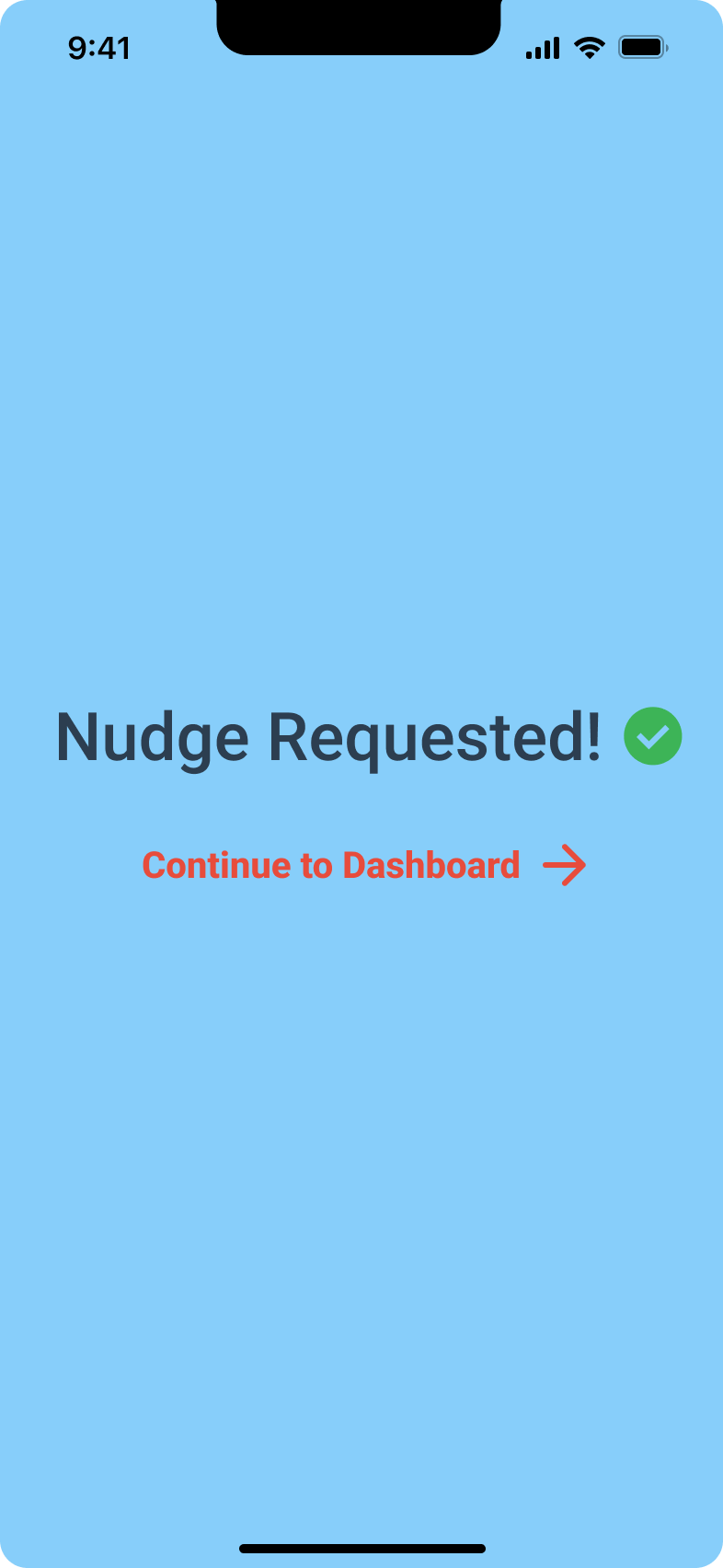


Requesting & Giving Nudges
Tracking fitness routine
Requesting & Giving Nudges
Conclusion:
In conclusion, the aim was to empower users through efficient workout tracking, fostering precision, consistency, and discipline. Competitive analysis of fitness apps like My Fitness Pal and Strong revealed varying approaches to tracking, catering to both beginners and experienced users. User interviews highlighted the need for structured progress tracking, clarity on tracked aspects, and accountability. Affinity mapping synthesized these insights, guiding the development of a tailored fitness app. Key elements of the design process included low and high-fidelity wireframes, branding the app as "Level Up" to signify growth and purpose, and selecting a light blue color palette for its inclusive and harmonious connotations. The logo featured an upward arrow symbolizing progress. Testing played a crucial role, with Usability Test 1 revealing color contrast issues that were addressed in subsequent revisions. Insights from testing refined the design, ensuring improved usability and user satisfaction. This project illuminated the importance of tailored fitness solutions, informed by user insights and refined through iterative testing. It underscores the significance of inclusivity, clarity, and accountability in fitness tracking apps, laying a solid foundation for future endeavors in user-centric design.